UI/UX Designer Internship Experience at Harian Kompas

Overview
Summary
As a part of my internship at Harian Kompas. I help to build website for Kompas Belajar project, an e-learning platform for Harian Kompas’s internals. I worked in collaboration with other designers, handing over the project to engineers for development, and presenting it to stakeholders. I also documented all of the design processes to provide clear pathways for designers and developers who work on this project in the future.
My Role
I was assigned to UI/UX Design team along with my intern colleague who has worked on this project from start. I’m responsible for testing the website to the user, reiterating the design from users’ feedback, document the design along with the development stage to make sure that the product’s prototype is delivered successfully.
The Starting Point
Onboarding
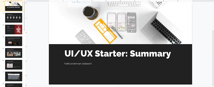
My first week of the internship is started by studying the basics from must-read UI/UX books, such as Don’t Make Me Think by Steve Krug and Refactoring UI from Adam Wathan. My mentor gave me these references as a warm-up before working on the real project: Kompas Belajar. I learned the basics of product usability from Don’t Make Me Think and how to do a UI design job from the other book that I summarized here:

The next week, I met my intern colleague that has been assigned to the Kompas Belajar project since 3 months ago. He was doing a good job of starting the project by conducting user research, mapping the problems and user’s needs. Also, he and the team has almost finished the Kompas Belajar website, so the rest is all about reiterating and testing the designed product before handing it over for the development process.
This is where I joined the team as a UI/UX Designer Intern. My mentor welcomed me by introducing the scope of the Product Development team for Harian Kompas digital products, such as Kompas.id website and mobile app, and Kompas Belajar ongoing project. My intern colleague tells me everything about this project so I can handle this project afterward since my colleague's internship period is about to end.
Kompas Belajar Project

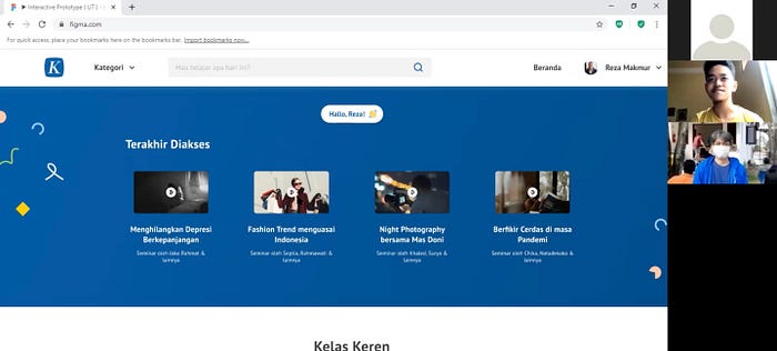
The first design sprint assigned to me is preparing Kompas Belajar interactive prototype and testing it into users in the next sprint. I helped my colleague to build the prototype in Figma based on the usability testing scenario. I learned the scenario first to get an understanding of how I will approach users later on usability testing.

Before the real usability testing, we organized a pilot project to see how our prepared scenario works. One of my mentors become the acting user while my colleague and I take the role of interviewer and observer.
The usability testing consists of many steps, such as a napkin test to see how the users see the platform, the real usability testing to see where the problems occur and an evaluative interview to get to know how users feel about the platform.

From this usability testing, I learned how to handle users with various personalities. There is a moment where users can’t be contacted so we have to look for another user with a similar persona. The other challenge is user’s tight schedules so we must speed up the usability testing process that affected the comprehensiveness of the results.
After collecting the research data, we write the UT report by synthesizing the problems we found. Then, we presented it to the team to decide what are action items must be done in the next stage of the design process.

Reiterating the Design
There are some elements in the Kompas Belajar website design that need to be reiterated. From the user testing, we found that some users are not aware of the class types differences, thus they hard to find the desired class. Some users also think that there is no need to place a leaderboard in the platform because it doesn't really match the company culture, so we reconsider the leaderboard feature for later.
There are also some considerations to reiterate the design based on technological limitations. Search and user-related features (e.g.: recommended classes) are relatively hard to be developed in a short time. We only have 2–3 months to deliver this website to stakeholders. Thus, we must prioritize which features to be developed first and which are for later. The product that will be developed is called MVP0 (Minimum Viable Product version Zero) which means the earliest stage product can be developed.

Development Stage
This is the stage where my colleague has done his internship period, so there are only me and my mentor to pass on the Kompas Belajar project. This stage is all about handing over the designed website to the developers.
First of all, we designed the timeline, features prioritization, and defining the sprints based on four pages we decided to develop first: Landing Page, All Class Page, Class Detail Page, and Video Page.

We also held a daily standup meeting to check the progress every day so the project is always on track. In this daily standup, I usually reported what are the blocks for me to reiterate the design, what have I done in a day, and to communicate how every element of the design should be developed, such as how the floating card interact with the user, button color, the user flow, etc.
Design QA
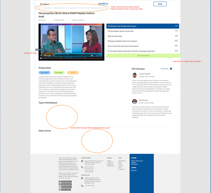
When the overall website is almost done developed, my mentor and I conducted a design quality assurance (QA) to make sure that the developed website is not far too off-track from the designed one. This is one of the most important parts of the product development process to find the flaws and fix them immediately before launching the product to end-users.
I found that in the early stage of development, there are some flaws including overflowing content, ruined spacing between contents, and some inconsistency in elements. This is my part as UI/UX Designer to note these flaws and communicating back to the developers for fixing.

Building Project Documentation
The last part of my internship period in Harian Kompas is accompanied by the launching of the Kompas Belajar project. Since it is still in the early stage, I need to build complete documentation of the design process including what went well and what needs to be done later. This documentation will be a powerful guide for future designers and developers to fix, revamp and add more features into it.

End of The Line
These past 4 months have taught me so much about teamwork in the product development process. I started with zero experience in such an industry as a team, and then I found a great mentor and team members. I learned to manage a project, communicate with users and other team members to work together.
I hope that my works in Harian Kompas will be a meaningful experience for me and all the people involved. I feel like this experience is a drive for me to grow better and helped me to achieve my career as a UI/UX Designer.